Article, Web App
The Anatomy of a Thousand Typefaces
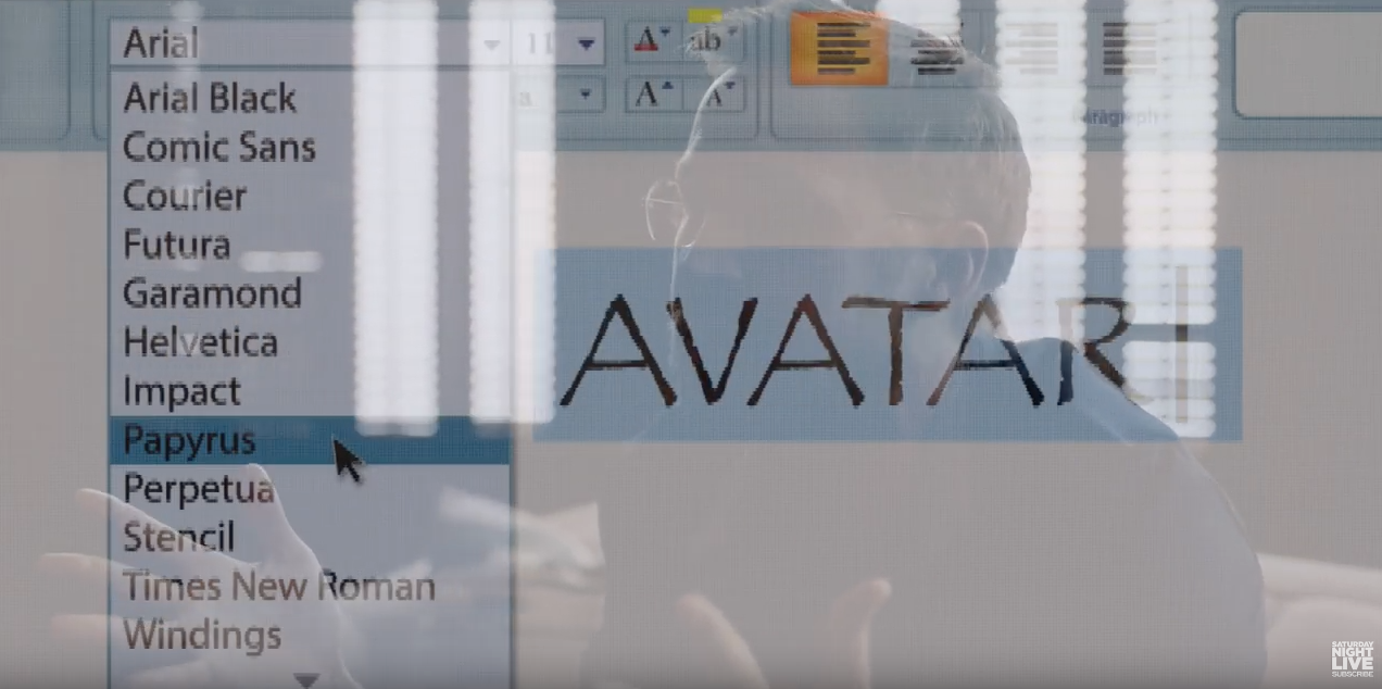
Even years after Avatar’s release, there’s one thing Ryan Gosling just can’t get over: the choice of the movie’s logo font “Papyrus”. In the parody produced by Saturday Night Live, the designer of the logo opens the font menu, browses the fonts one by one, and randomly decides to go with “Papyrus”.
The seemingly mindless choice of a font is a general problem with font menus: there are either too few or too many options.
On one hand, a limitation to system fonts, as seen in the video, can lead to a bad choice because there simply isn’t something better installed.
On the other hand, web font libraries with hundreds or thousands of fonts can be quite overwhelming and lead to a paradox of choice.
Dinner for none: The font menu’s bitter taste
The average font menu presents a list of available fonts, sorted by name, but completely unrelated otherwise: A typeface designed for bold headlines is followed by one designed for small user interfaces and then a fancy script typeface made for wedding invitations shows up. Now you either get trapped in a time consuming process of scrolling through the whole list from start to end or you simply decide to pick the first best match from the upper part of the list and call it a day.
This is obviously not an interface made for systematic exploration — but infinite surprises. While I like to be surprised, I also like to influence my odds.
A systematic approach to finding typefaces
There are various ways to limit the options. Before I dive into parsing font files, glyphs and metadata tables, let’s first have a look at classification, curated lists and then anatomy.
1. Classification
Early in design school I’ve learned about the history of writing and practiced calligraphy to understand how writing evolved and how tools had an immediate impact on the design of type faces.
This lead to sophisticated systems for classifying fonts based on their appearance throughout history. The simplest classifications are serif, sans-serif, monospaced, script and display typefaces. We can usually find those classes in form of filters on any font website:
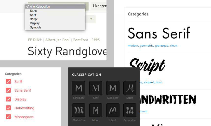
Those simple filters might still give us too many options. That’s when more specific terms such as transitional serif, humanist serif or blackletter can be introduced to differentiate typefaces of the class serif.
Sometimes those subcategories are available as tags. But sometimes they just don’t exist in such detail. Maybe there are too many categories? Maybe users don’t understand all those options? Maybe there is just no complete and consistent data available?
2. Curated Lists
Another way to put order into the chaos is to rely on the knowledge of others: Human-curated font lists. We can find those for example on Fontshop. There you can find collections based around a decade in history such as “1930”, based on similarity such as “Helvetica Alternatives” or application specific lists like “Branding” or “Newspapers”.
Similar lists can be found on Typekit, TypeWolf or FontsInUse. I think those lists are great and I encourage everyone to start making their own lists with fonts you have already worked with or seen in application. It will pay off in the future to have those references.
3. Anatomy
The most complex way to look at typefaces is to focus on their design details and to try to understand what makes a typeface good or special. Fortunately, there are books on type design, typefaces and typography. They can teach us how to make typefaces, how to choose them and how to use them.
One of those books is “The Anatomy of Type” by Stephen Coles. A few years after design school, this book was a refresher that reveals details about 100 well established typefaces. Stephen Coles uses terms such as x-height, width, weight, ball terminals, serif style and others to describe the quality of typefaces.
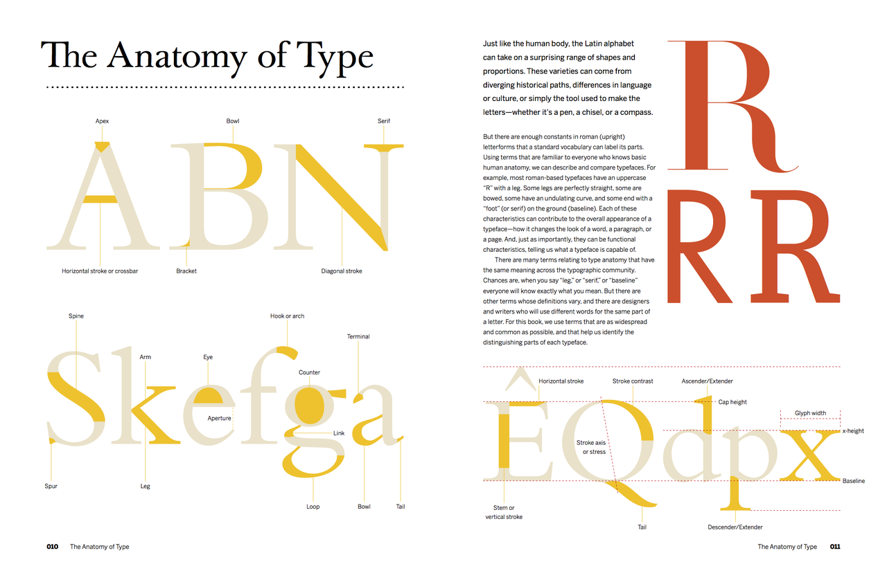
“The Anatomy of Type“ — A Graphic Guide to 100 Typefaces by Stephen Coles. A great book if you want to learn about the history and design details of popular typefaces.
After looking at those 100 typefaces I thought: what about the rest? What about the fonts on my computer? And the ones on the web? What are their xheight, width, weight and contrast? How can I find out?
Inside a font file: Lack of meta data
Before I started coding, I was hoping that I could find out about the properties of a font in an easy way. In theory, every font file comes with a variety of metadata tables that contain information about name, author, language and visual characteristics of the typeface. Width, weight and font family class are the obvious ones. But also information about xheight, cap height, average char width, ascenders and descenders could be found. Another set of metadata called Panose describes even more properties such as serif style, proportion, contrast and many more. Using font design apps such as Glyphs, anyone can inspect fonts to view this information:
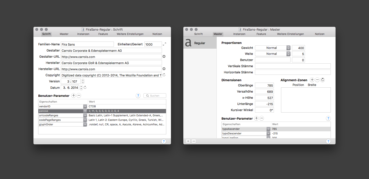
A screenshot of the “Font Info Panel” of the font design app “Glyphs”. It shows basic information about family name, designer, url, version, date. User definied settings show the Unicode Range and Panose information. The 10-digit code describes many characteristics, but this information is not always available as it has to be defined and measured by the designer or producer of the font file. On the right screenshot one can see metrics such as ascender, descender, x-height, and italic angle.
But the availability of this information depends on the work that has been put into making the font. While some fonts provide a lot of information, this isn’t always the case, especially not for free or open source fonts such as the ones from Google Fonts. But even if information is provided, it’s not necessarily consistent or complete enough to make comparisons based on it.
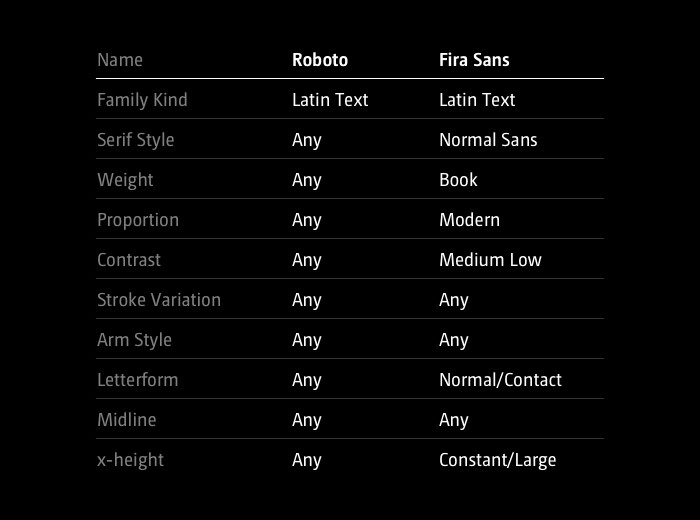
Comparison of Panose information available for Roboto and Fira Sans, both available on Google Fonts. While Fira Sans provides a lot, Roboto doesn’t. This metadata can obviously not be used to compare fonts…
DIY: Parsing fonts with opentype.js
So in order to classify and compare typefaces myself, I had to take a close look at font files and find automatic ways to extract information. Fonts are available in a variety of file formats, but eventually they are almost always available as TTF (TrueType Fonts).
Other formats are OTF (OpenType) that includes information for additional features such as ligatures or WOFF (Web Open Font Format) that can compress the font and store additional meta data.
These days, thanks to Frederik De Bleser’s opentype.js, we can inspect font files using JavaScript in a web browser. Opentype.js gives us access to vector information of all the glyphs included in a font file and it also provides access to key metrics and metadata tables.
A database of characteristics
In the following section I will describe how I measured contrast, x-height, width and weight of all fonts provided in the Google Fonts Library. The same methods could be applied to other font libraries such as Typekit or fonts from your computer.
Stroke contrast
The contrast describes the ratio of thin to thick strokes. There are typefaces with little stroke contrast, e.g. slab serifs or many sans serif typefaces designed for user interfaces, e.g. Roboto or San Francisco. There are others with a lot of contrast, such as Bodoni or Didot. To measure the contrast, we can trace the outlines of an “o” and look for the smallest and largest distances between inner and outer shape.

The contrast of a typeface may be measured at the thickest and thinnest part of an “o”.
It’s a simple and comparable letter shape that almost always consists of two paths. It’s a good candidate for estimating the contrast of a typeface. (Side note: While seemingly simple, the shape of an “o” is actually quite hard to draw well, because the stroke needs to smoothly grow and shrink between thin and thick.)
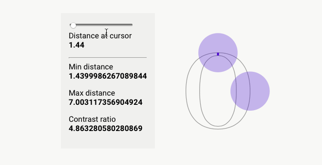
opentype.js provides convenient ways to get path data to draw characters to a SVG element. I actually draw inner and outer paths separately. Then I used an algorithm that travels along each path and measures the distance at each point. We can then calculate the ratio between the longest and shortest distance and voila — we have a comparable contrast measurement.
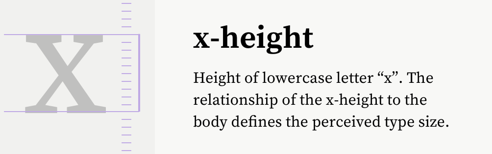
x-height
The x-height is an important characteristic that can be an indicator for legibility and perceived size of a font. It is usually measured at the top of a lowercase x.
The x-height can be measured from the glyph information that opentype.js provides.
opentype.js provides us with the needed measurements, namely yMax for any glyph.
In addition to the absolute measurement, it might be useful to also compare the x-height to the height of the ascenders. Thus, we can get percentage values such as “the x-height is 60% of the uppercase letters”.
To make the values comparable (some fonts use 1000 unitsPerEm, others 2048 unitsPerEm), it is necessary to normalize the values and map them to a range of 0–1.
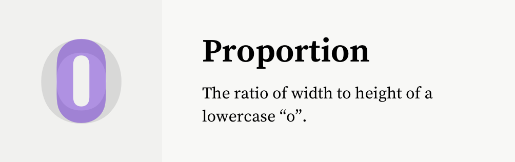
Width / Proportion
With this value I try to grasp how narrow or wide a font is. Is it rather condensed or extended? One idea I had was to measure the width of an “M”. But to make those comparable, one would need to put those into context of the overall size or the x-height. Some typefaces also might have very special “M” glyphs that don’t represent the rest of the typeface.
Another idea is to calculate the average glyph width using a sample word like “Hamburgefontsiv”. While this works quite well, it also would need some normalization in respect to the overall design and height of the typeface.
Another approach is to look at the proportion of an “o”. This gives suprisingly good values for comparing the widths of fonts.
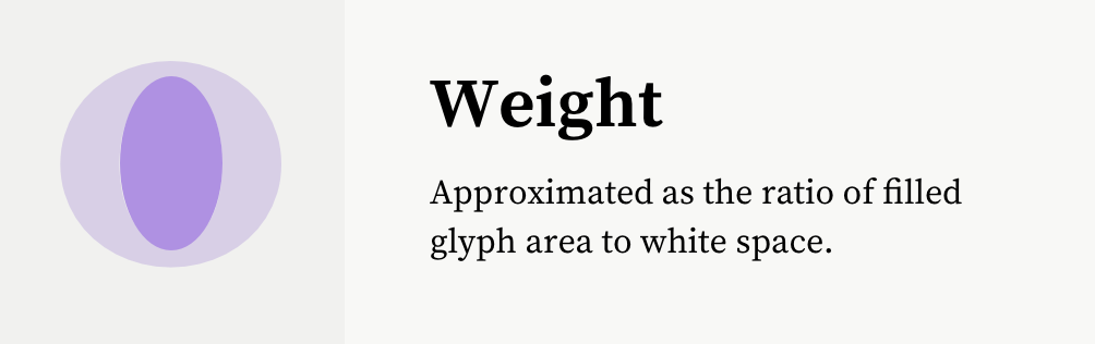
Weight
To measure the weight, I render the lowercase „o“ character to a HTML canvas element, fill it black and paint the background white. I then measure the ratio between black and white pixels. A script or hairline font will show very little values, while a very heavy blocky font will show high values. This gave me okayish results, but I want to improve this by measuring actual stems of glyphs in the future.
Spacing
When all glyphs of a typeface have the same width, they are called monospaced. Important here is, that we can’t necessarily look a the glyphs themselves to determine the width. Even in a monospaced font, a dot character takes less visible space than a “m”. Thus, we need to take into account the advanceWidth property that describes the invisible width around a glyph. Here we can find out that Google Fonts uses monospaced as a style classification, but not to indicate the technical property. Fonts such as Lekton or Libre Barcode are not listed as monospaced, but technically they are.
Similarity
Once we have a table of values, we can normalize those and then compute distances to see how similar fonts are. I implemented a very basic version of it that isn’t terrible, but could be better with higher accuracy of the data. Also, we might perceive similarity different than an algorithm that treats every characteristic equally. In that case, we might need to weigh some properties more than others.
The font parser analyses each font, draws hidden SVGs and canvas elements for measurements and saves the data to a JSON file.
Demo
I’ve built an interface to make the database accessible. Fonts can be viewed in a grid of varying size to get an overview over all fonts or to take a look at details of a few fonts.
Fonts can be sorted by weight, x-height, contrast, width, name and number of styles. Depending on the sorting criteria, adequate glyphs are shown.
Area charts show the distribution of values and can be used to filter out certain values. Each font has a detail view with a few samples, glyphs, metrics, Panose information and similar fonts.
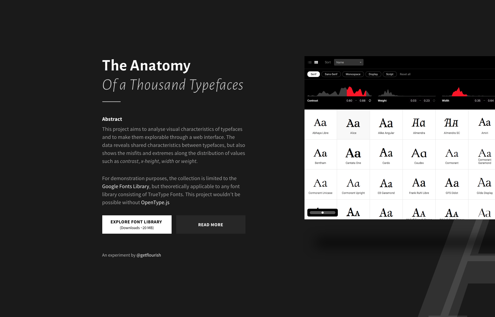
Screenshot of the project’s website
Explore the dataset
https://useratio.com/the-anatomy-of-a-thousand-typefaces
For some reason some fonts fail to load in Safari, so I recommend to use Chrome.
Screencast
https://vimeo.com/239318934
Findings
The dataset invites one to explore and find similarities and irregularities. Setting low contrast and serif will return all the slab serif fonts. Low x-height will give us mostly handwritten or script fonts. Very high values often indicate all caps typefaces.
Misfits
Selecting the lower or upper ends of the spectrum will often return very weird designs. They mostly fall into the category display.
Ugly differences
The grid overview reveals the awful differences of baselines and alignments. Some fonts are radically off the grid. And even with subtle differences, it becomes clear that a simple 1-to-1 font substitution is almost impossible — with the exception of some popular fonts that all seem to share a similar skeleton.
Average is good
It’s interesting to see that commonly used fonts we consider to be good, all fall into a similar subset. By adjusting the filters, I can cut down the list to less than half and all the popular fonts will still be there. Selecting the average ranges is a simple way to filter out the misfits and extremes.
Forked Fonts
We can also find fonts that look exactly the same as others but with different names. Some of those are forks that extend the character set to support additional languages, e.g. Alegreya & Sahitya.
Number of styles
Above all, the number of styles a font has is a good indicator for its quality — at least as long as designers still need to make a lot of effort to design various weights and styles. Variable fonts are on the horizon and infinite customization may be the future. But until then, it’s good advice to work with font families that have multiple styles. Thus, sorting the collection by number of styles is a fast way to get an overview of the best fonts available.
Summary
This is a complex way of looking at font exploration. Ultimately, the quality of results depends on the quality of the fonts and the data around them. Only browsing Google Fonts is very limiting as their overall quality isn’t known to be the best in class. I’ve already started to run analysis on the Typekit library and ultimately met new challenges of user interface performance when previewing so many fonts. Such an undertaking requires proper caching and preloading strategies. But I don’t have to go that far just yet.
With no AI involved, I now have a good understanding of what’s inside font files and what’s missing. The more and more I got into this, I realized how massive the field of font technology is and that I’m only getting into something that’s been done for decades already.
Possibilities
With such a dataset, one could do more things:
- find fallback fonts with a similar width or style
- automatically adjust font sizes and line heights based on x-height
- find font combinations based on similarity or difference
- build a custom font menu for Avatar’s poster designer
- …
Try the app
https://useratio.com/the-anatomy-of-a-thousand-typefaces
Watch screencast
https://vimeo.com/239318934
Before I publish the raw dataset I want to improve the analysis and try to add more characteristics. If you have any ideas for improvement, don’t hesitate to leave a comment. Thanks for reading!
Further reading
Panose Classification Metrics Guide
The guide from 1991 describes in detail how to measure individual glyphs to derive comparable metrics. Unfortunately those measurements need to be taken by hand and can be quite time-consuming.
Taking The Robots To Design School, Part 1 by Jon Gold
Already in May 2016, Jon Gold wrote about his approach to analysing fonts in depth, covering topics such as rule based design, artificial intelligence and the relevance of such datasets for design tools.
Google Fonts Tools
A set of open souce tools that are used to analyse fonts for use on the Google Fonts website. You can find similar algorithms there, but also other ones that for example determin the italic angle of a font.
Font Bakery
Font bakery is a set of Python tools that runs checks on TrueType files, and Google Fonts related metadata files.
Appendix
Q: Why didn’t you use data from web font services?
A: Services that provide fonts such as Typekit, Google Fonts, Fontstand, Fontshop, MyFonts, etc. all provide their own set of filters with more or less fine control. The APIs of those services also differ in the amount of information that is available for each font. Usually the category is provided, but other information is either left out or not compatible between the services.
The following example shows, that all we get from Google Fonts Web API for Roboto is its category sans-serif, variants and subsets. https://gist.github.com/getflourish/d79836b0bebb6b44f76389b623fd7dc1
The Typekit API provides more information about width, x-height, weight, classification, contrast, capitals and a recommendation.
https://gist.github.com/getflourish/8c7c9ab4ddcf422cbb77866b5cf61575
As you can see, in the example API result, the information about a font is provider-specific. In order to be more flexible and independent I started to do my own analysis.