I design interaction between humans and technology with visual language and code.

Introduction

My life and work

  • 1987
    Hello World
    Cottbus, Germany
  • 2007
    A-Level
    Humboldt-Gymnasium Cottbus
  • 2008 – 2013
    Interaction Design Student
    FH Potsdam
  • 2011∞
    Freelancer
    Raureif and others
  • Summer 2012
    Interaction Design Intern
    Behance, New York
  • 10/12 – 10/13
    Visual Designer
    Adobe Behance (Remote)
  • Summer 2013
    Bachelor Thesis: Sousveillance
    FH Potsdam
  • 10/13 – 04/14
    UX Designer
    Ergosign Zurich
  • 06/14∞
    Interaction Designer
    Ginetta Web/Mobile Zurich

I’m an Interaction Designer and former Interaction Design student at the University of Applied Sciences in Potsdam. I’ve been working on a lot of projects including application design, graphic design and programming — no matter what the target device was: a computer screen, multi-touch cell or full-dome projection. Here is a selection of my projects:

Chummy

A personal mail client for Mac

Regular mail applications are like mail boxes that never get empty. Your inbox: never zero. Because everything sits on top of each other, things inside your inbox require sorting in order to find what you need. Since email was introduced no one seems to have questioned how we deal with it; we get used to the idea of email as spam and business. Anyway, we love to send and receive mails with personal content from our family, friends and colleagues.

Chummy Icon

With Chummy, we introduced our understanding of personal communication: focus on people and conversations. There are no inboxes, no folders and no complicated boolean searches. Instead you can easily find photos, videos and links that someone had sent you the other day. The streamlined, minimal interface helps you to handle all your important mails.

Chummy Quick Reply

Have you ever looked for a link to an awesome website, that your friend sent last week but you can’t find it anymore? Or have you looked for the photo of a newborn family member? With the introduction of media filters, Chummy helps you to find that content within your emails without thinking about boolean searches.

Chummy Photo Filter

Additionally to Quick-Reply, you can compose a new email in a separate window. Good old Courier and a yellowish background help you to write a clear and structured text that your friends will love.

Compose a new Message

Chummy is for Mac and comes with all the comfort you already know. Simply import your existing accounts and emails from Mail and you are ready for a better mail experience.

Chummy First Launch

But how did we craft Chummy? Since this has been our first attempt on making a graphical user interface for Mac, Julian and I were happy delighted to be assisted by Timm and Frank, who both have had a lot of experience working with graphical user interfaces. They introduced us to standards and attention to details.

Concept wise, we quickly agreed on certain essential features: media filters, persons, conversations. We met at the library and worked separately for only 15 minutes on our personal interpretation of how the concepts would transform into the layout of the application. We’ve never worked at such a pace before but it probably was the best thing I’ve learned: limit the time and be more productive.

Sketch

After sharing our sketches we were pleased that we had very similar ideas. After the first presentation we continued our work separately. Julian made an impressive first draft with standard GUI elements with HTML and CSS3. Meanwhile with Photoshop, I worked my way towards a more customized look and feel.

The feedback was positive. While we proved that our concept would work with standards, we continued working towards a more unique style that would become present in the Mac OS X Lion after we finished the project. Of course we were aware of apps like Reeder, Tweetie and the alike but we continued regardless with our own vision of the application. We both crafted the application to look like we wanted it to be, I designed the icon and we finished a fulfilling project.

Logbook

Collect Stamps with your iPhone

Travelers love to capture their impressions. They make notes, take photos and collect things to remember what they have experienced. We believe that exhibitions are similar journeys and that revisiting this experience is as important as the actual time on location. Therefor we’ve invented the digital Logbook that keeps track of everything that visitors find interesting. It contrast to other solutions, it does not try to overwhelm you with a catalogue of everything. It is as simple as collecting stamps when we were young.

Almost every big museum or exhibition offers apps for three reasons: content, navigation and participation. Most of them do a good job in providing additional media such as articles, images, videos and integrating maps of the exhibition space. Moreover, nearly all of them replace former audio guides by copying the well-known procedure of entering 3 or 4 digit numbers to access the information. But at times we tend to get a little bit frustrated when we fail to enter our smartphone pin correctly; we thought that there must a better way to connect an app with an exhibit.

As part of our class, “Connect to Science,” at the University of Applied Sciences, Potsdam, we’ve developed a concept such an exhibiton app that used a physical interface to connect to the exhibits. Users start their journey with the empty logbook app that can be filled with unique stamps — like a passport, keeping track of everywhere you have traveled.

Considering the the broad spectrum of users, from kids to seniors, we felt the need for a flat information architecture and came up with three views: Collection, Review and Map.

With successful apps such as Path and Facebook, we were inspired by their navigation and re-interpreted it to fit our needs. Users can swipe left and right to switch between the different sections of the Logbook. To collect something new, you simply orient the device to landscape mode and stamp on the blank canvas. Your Logbook will then be packed with articles, photos and videos waiting to be reviewed instantly while you are on the go or relaxing comfortably at home. Users can swipe left and right to switch between the different sections of the Logbook.

To collect something new, you simply orient the device to landscape mode and stamp on the blank canvas. Your Logbook will then be packed with articles, photos and videos waiting to be reviewed instantly or when you are at home.

Our prototype setup consists of a wooden stamp that can be recognized by our web app that runs on an iPhone.

On the hardware-side, we drilled a hole through the stamp, attached three soft conductive pads to the bottom and connected them to a copper wire that ends at the top of the stamp. As the stamp touches the screen of the iPhone, it recognizes a pattern of touch points that relates to the specific stamp. Variations are endless, considering 5 touch points that can be placed at various distances from each other and thus forming unique patterns.

On the software side, we prototyped parts of the app with Javascript while making heavy use of CSS3 transitions. Having both, stamp and app, we were able to turn our design into a prototype to demonstrate our concept in our video.

Conscape

Mapping Berlin’s Live Music Scene

Berlin is the best place for live music in Germany. But Berlin is also a huge city and finding your way around can be difficult. You try to find the clubs that play music you like. But you might also want to know where the big clubs are, or what areas are good for certain kinds of music. Then, once you find what you are looking for, you will want to know what else you can do there before and after the gig.

Conscape is a multi-touch application that visualizes 5 years of Berlin’s live music scene on an interactive map. Users can travel through time and see where what kind of music is played. You can browse all of Berlin’s gigs and how many people attended them. You can also spot trends over time, and surprisingly, you’ll learn contrary to popular belief, it’s not all electro all the time.

The class “Urbane Ebenen” by Till Nagel was all about interactive maps on multi-touch hardware. I teamed up with Jeremias and Julian to work on the topic of music.

We wanted to explore the music scene in Berlin using data from Last.fm. Their demographics are limited, but in the context of our class, that was okay with us. We mapped the number of visitors for each event to the corresponding locations on a dynamic map served by OpenStreetMap. You can then see the events, how many people went there and the genres that have been popular.

Besides technical hacks to get ModestMaps working with the multi-touch framework OpenExhibits, I developed the interactive timeline tool that would enable us to define a time range with a zoom gesture. Each bar represents a day with its height showing the number of events on that day which would reveal interesting patterns. Initially all data from 2006 to 2011 is displayed. When you zoom into the timeline you can narrow it down to certain months or weeks. The left and right borders are the first and last dates that are visualized on the map. You can then drag the timeline to travel through the history of concerts in Berlin.

A similar interactive timeline is used by Google Finance, but because we have no mouse and no precise sliders and didn’t want to duplicate timelines, we’ve developed our own solution that we haven’t seen anywhere else so far.

By the way: we talked about Conscape at Design Meets Data. We explained our design process and showed what did and didn’t work. Oh, and we uploaded our slides.

Happy Virus

Live Visual for Hundreds

  • TOGETHER WITH
    JEREMIAS VOLKER
    TOBIAS VOLKER
  • DESIGNED FOR
    HUNDREDS
  • YEAR
    2010

Jeremias Volker asked me to support him producing live visuals for the tour of Hundreds in spring 2010. Eva and Philipp Milner make lovely music and I was convinced that we would enhance the shows with great visuals.

After initial experiments I decided to get away from After Effects and developed a live visual for the song “Happy Virus” with code. The inspiration for the icosahedron relates to research about viruses that are often built of repeated subunits.

The visual has been built with Processing in conjunction with a hardware setup that handled the communication between the program and the instruments.

The project was made possible by Jeremias Volker and Tobias Volker who worked on visuals for other songs and managed the technical setup on-location. All visuals are supported by lights and smoke.

Glowified

Let me be your VJ!

In my first semester, I got in touch with Processing. Inspired by a photo I took, I soon started to experiment with particle systems. I developed a better understanding of how physical systems can be represented with code. Then came “Beyond Processing into VJing”, a class given by Christopher Warnow and Stephan Thiel.

Glowified is an interactive, audio-reactive music visualization made with Processing. Glowing particles are the key element of the system. Able to form various arrangements, they react on frequencies and beats recorded by a microphone. Additional parameters can be controlled via a touch interface running on iOS. The system is flexible enough to enable the user to adapt to different styles of music.

It all started with this photo of tinted water that I took while practicing flash photography. It inspired me for a long time. The process of diffusion, where particles move between areas of different concentrations, results in beautiful arrangements.

I wanted to recreate that system, but realized that I wouldn’t be able to get it at a good performance. It would require shaders and fancy algorithms. I refashioned my idea and came up with interesting systems that became part of Glowified later.

Finally, we had a live performance in a small club back in time. It was a nice experience and I realized that the system was flexible enough to deal with various music styles.

Kaktus

Spare time excercise

  • YEAR
    2010

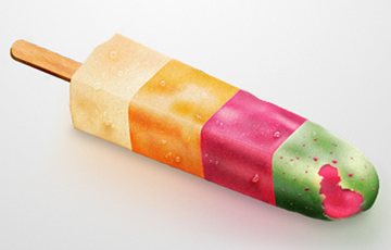
Kaktus is my favorite ice pop. I wouldn’t call it love but I like the different facets of it. Three different flavors and the super crazy green top that makes my mouth sparkle — enough to honor it digitally.

I had some spare time and wanted to try some new techniques that could come in handy for later icon designs. While licking some Kaktus in the summer it was obvious what I would do. It turned out that I felt more comfortable working in Photoshop after I created the basic shapes in Illustrator. I’m just more familiar with post-production techniques that I know from my photography work. Do you want some ice?

Motion Graphics

Hello Andrew Kramer!

  • SUPERVISION BY
    PROF. KLAUS DUFKE
  • DESIGNED AT
    FH POTSDAM
  • YEAR
    2009

With the rise smartphones and tablets, motion became an essential part of natural user interfaces. As we interact and directly manipulate objects on touch screens, we expect them to behave like real world objects with gravity and friction where nothing moves linear.

I wanted to get more than a vague feeling of what motion and animation means. How can I break out of static screens and print? What kind of easing makes sense and feels fluid? In the class »Media Basics«, I have learned a lot about After Effects, keyframe animation and special effects. It was a lot of fun and I came up with some short clips.

Tesa is a really popular brand. What attracted me to their logo was its simplicity. As a class assignment we had to pick a logo and animate it. I came up with a fast animation that presented the logo and added a nice page turn effect that revealed the claim. The voice was part of a commercial.

As counterpart to that simple keyframe animation, I wanted to play around a bit more with AfterEffects to see what else I could achieve. This opening sequence for a DVD menu has much more depth even though the elements are still pretty simple.