SwiftUI
How to increase the tap area of icons in a SwiftUI Navigation Bar
One of the first things I wanted to do in SwiftUI was to place a plus icon (+) in a Navigation Bar. This is a very common design pattern for adding items, such as calendar events, alarms, or anything that could be stored in an Array, Set or Core Data Model.
The problem: When running the app on my iPhone, I’ve noticed that the button was simply too small to tap on. Visually it looked okay, but the tap area was too small to actually trigger an action.
Paul Hudson writes about this in Creating books with Core Data on November 16th 2019:
Two SwiftUI glitches might affect you while following along, depending on which Xcode version you’re using. The first is that you might find the + button really hard to tap, because whereas UIKit extends the tappable area to make it easier to interact with SwiftUI does not, so you need to tap exactly on the +.
I’ve found a way to fix it, but because I’m still new to SwiftUI, I don’t know if that’s the right way. I somehow expect SwiftUI to be smart enough to handle it because the pattern is so common. If you know a better way, please let me know!
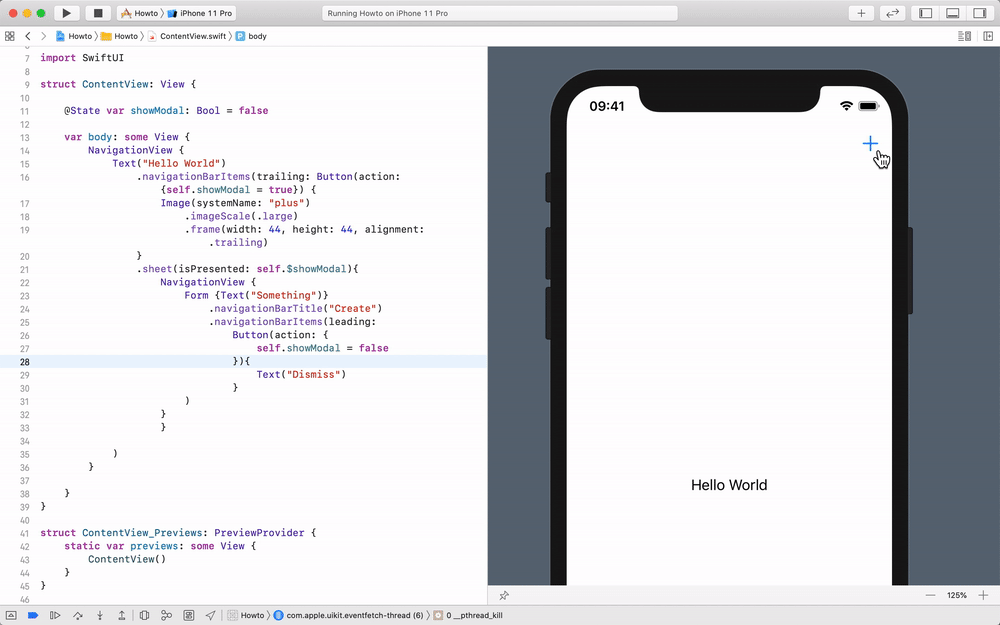
We can use the view modifier navigationBarItems to add leading and trailing views to it. In this example, we’ll add a trailing Button holding an Image. The Image shows the plus from SF Symbols.
NavigationView {
Text("Hello World")
.navigationBarItems(trailing: Button(action: {}) {
Image(systemName: "plus")
}
)
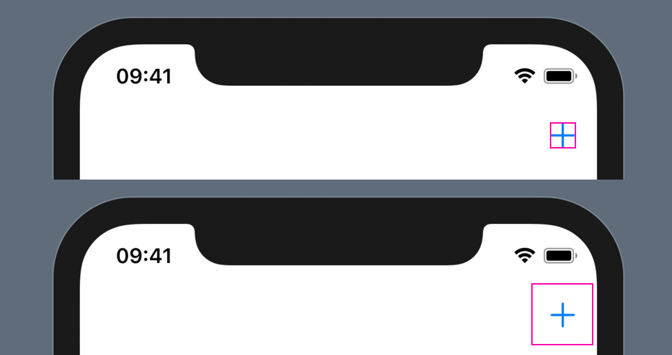
}Even though this will show the plus button as intended, the button is barely tappable. This is because its tap area is just as large as the visible shape of the plus. I would expect such icons in a Navigation Bar to automatically be sized correctly, but as far as I can tell, we need to manually size the icon accordingly.
We can fix the issue by increasing the size of the frame and aligning it to the edge of the screen:
NavigationView {
  Text("Hello World")
    .navigationBarItems(trailing: Button(action: {}) {
      Image(systemName: "plus")
        .imageScale(.large)
        .frame(width: 44, height: 44, alignment: .trailing)
    }
  )
}
The imageScale modifier will optically increase the size a little bit, but more importantly, the frame width and height will increase the tappable area. With that, the icon is easier to tap on and we‘ve improved the accessibility of our app.
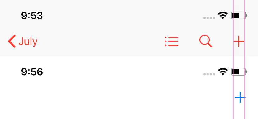
While the size and usability are good, the alignment of the icon still seems a bit off compared to other apps such as Calendar. I don’t think Apple wants us to put that much thinking into getting icons to show up correctly in a navigation bar, so maybe there’s a better way than what I’ve described. If you know, let me know!
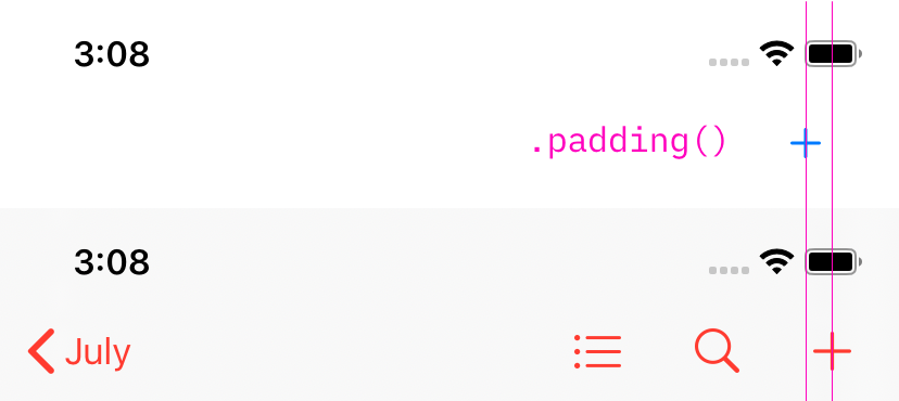
Roy pointed out on Twitter, that we could also try to use .padding() which does have a positive effect. Paul Hudson mentions it in his article The Complete Guide to NavigationView in SwiftUI:
Tip: Buttons added to the navigation bar have a very small tappable area, so it’s a good idea to add some padding around them to make them easier to tap.
Trying that does have a a positive effect, but the alignment is quite different from other apps. Eventually this might be the way to go and it just depends on Apple to correct it in a future version of SwiftUI :)
That’s pretty much the investigation I’ve done so far. I’m sure in a few months there will be a simple standard way and all of that trial and error will be obsolete 😅
Beyond the button: Showing a sheet
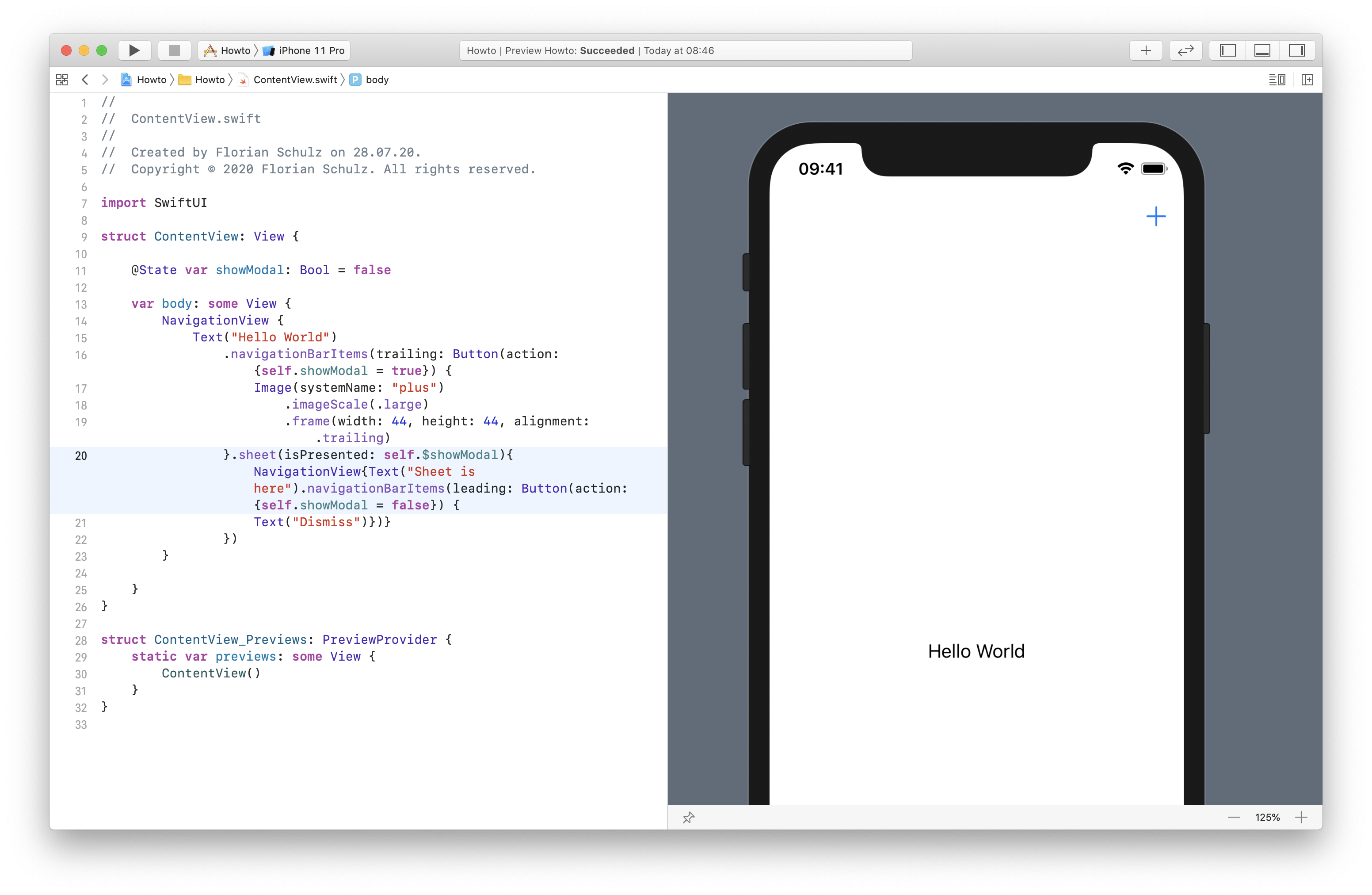
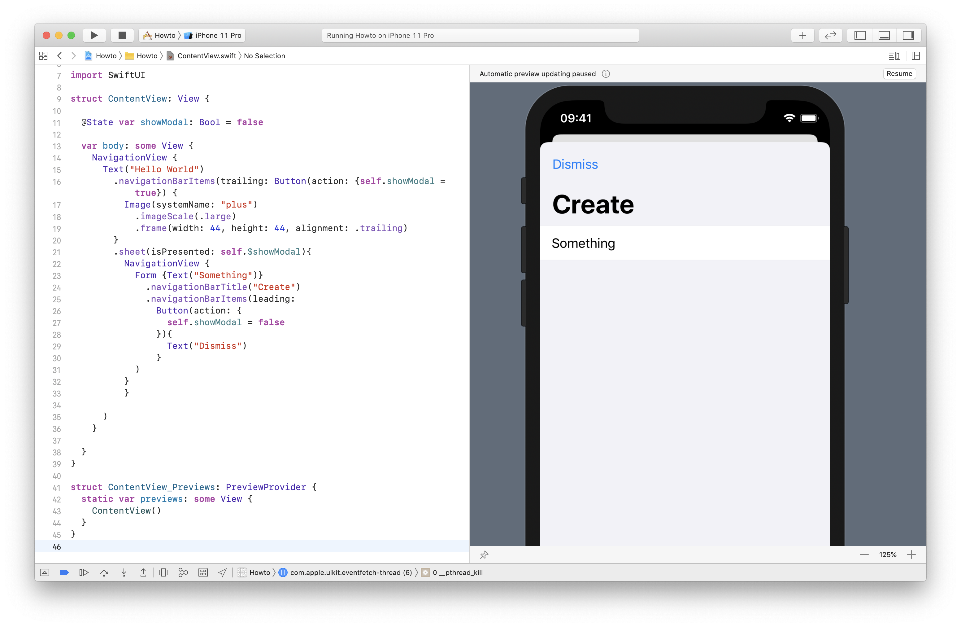
Usually, when tapping the plus icon, we would want to show a form. We can use the sheet view modifier for that. We need a @State variable to keep track of its visibility. Once we have that, we can control it using the Button action. By wrapping the content of the sheet in another Navigation View, we can then provide a title and dismiss action.
//  ContentView.swift

import SwiftUI

struct ContentView: View {

  @State var showModal: Bool = false

  var body: some View {
    NavigationView {
      Text("Hello World")
        .navigationBarItems(trailing: Button(action: {self.showModal = true}) {
          Image(systemName: "plus")
            .imageScale(.large)
            .frame(width: 44, height: 44, alignment: .trailing)
        }
        .sheet(isPresented: self.$showModal){
          NavigationView {
            Form {Text("Something")}
              .navigationBarTitle("Create")
              .navigationBarItems(leading:
                Button(action: {
                  self.showModal = false
                }){
                  Text("Dismiss")
                }
            )
          }
        }
      )
    }
  }
}

struct ContentView_Previews: PreviewProvider {
  static var previews: some View {
    ContentView()
  }
}