App development
Designing with Ratio
With Ratio, I’m trying to turn my knowledge about design, writing CSS and creating design systems into a series of tools that enable both designers and developers to explore more and worry less.
Two years ago, I published Designing with Intent in which I wrote about design tools that can capture the intent and relationships of a design in addition to mere properties and values.
Back then, I used methods like “interpolation” and concepts like “contrast” to describe a way of thinking and designing in extremes — between minimum and maximum states.
Instead of tweaking a dozen different font sizes for headings and body copy, one could define the base font size and scale factor that control the hierarchy between all of them.
Instead of tweaking text color and background color individually, one could define the desired contrast between them.
Instead of tweaking line spacing, font sizes, font weights, letter spacing, etc. for different screen sizes, one could define the relationship between those properties and have them dynamically adjust.

In the meantime, I took those concepts further and turned them into a web design tool, aimed at helping design for the browser, in the browser. This article explains some of my thinking behind Ratio and introduces some aspects of the interface in greater detail.
But before I go into that, I want to elaborate a little bit on design and programming and the popular question “Should designers code?”
Programming design
I think programming can be part of a design process, but it should not require switching to a text editor to do so. Creating abstractions and establishing intentional relationships are concepts that are too powerful to stay outside of a designer’s toolbox. They enable working with a dynamic medium and taming the uncontrollable.
The concepts that I wrote about two years ago actually don’t require a lot of code. But they do require fiddling with your text editor in order to fine tune values by typing numbers. They require getting out of the design tool in order to design.
In his genuine book “Flexible Typesetting”, Tim Brown wrote:
Your design tool is working against you. It is stuck in the traditional mindset of absolute measurements. This is precisely one reason why people very good at web design argue that designers should learn to write code. No mainstream design tools — and I work for a company that makes mainstream design tools — are completely appropriate for the practice of typesetting today. Some of the smartest people I know are building more appropriate tools, but for now you’ll need to make design decisions by writing and testing code. — Tim Brown, Flexible Typesetting
I fully agree and believe that a way to express and use more dynamic and flexible design concepts in an actual design environment would be beneficial for many people. It would be a lost oppurtunity for designers to leave those techniques up to developers to figure out how to implement design. Instead, we could be using aspects of programming — variables, interpolation, functions — to actually design.
If we utilize dynamic units, calculations and formulas, we can start to take back control over the web as a design medium. When we let go of the static mindset that comes with pages and artboards — fixed snapshots of an inherently dynamic medium — we can start to embrace the real potential of the web.
We can start to actually design interactivity. We can do the exciting work that’s all too often left to the developer’s interpretation. We can start to think in terms of intention and abstraction. When we think about web design, we need to think about the whole system and how things relate to each other.
It’s about the relationships, the boundaries, the extremes, and everything in between.
But in order to do so, we need tools to free our mind. We need tools that get out of the way. We need tools that allow us to design at the speed of thought. We need tools that are fluid and adapt. We need tools that suit us. Thus, we need to shape our own tools so that they can shape our work.
Introducing: Ratio
Instead of waiting for others to build a better design environment, I’ve created it myself. It’s called Ratio. It combines modular scales, fluid typography, color transformations, design tokens and the layout power of modern browsers.
Ratio equips designers with the same tools and concepts that developers use to implement complex design systems. Take creative control over typography, color, time and space by using variables, scales and functions. By appreciating the abstract and rationale, designers get the chance to explore more and worry less. Discovery instead of pixel pushing.
Under the hood, design in Ratio is powered by CSS. Thus, you can do everything that CSS can do. It’s certainly not the first tool doing that, but my approach is to be slightly more transparent about the underlying code and utilize it. If you want, you can always do some hand-coding in between.
But more importantly, Ratio provides interfaces that help you work with CSS without actually writing it. It helps you to visualize your design system and create abstractions when you want to. It’s my personal take on the web inspector. I love web inspectors and what they can do. But what I want is a web creator.
Introducing: Ratio from Florian Schulz on Vimeo.
The power of CSS
Building a tool on top of CSS comes with a lot of built-in responsive design features. Just think about all the relative size units that you can work with: %, em, rem, vh, vw, and many more that enable us to encode relationships for dynamic design systems.
- % — a fraction of the element’s parent’s width
- em — a size relative to the element’s font size
- rem — a size relative to the root element’s font size
- vh — a fraction of the viewport’s height
- vw — a fraction of the viewport’s width
- vmax — the larger value of either the width or height of the viewport
Modern browsers support almost 500 CSS properties and CSS has become more and more powerful in recent years. One of the most recent additions, CSS Grid, introduces new units like fr (fraction), and functions like calc, repeat, min, max and minmax help to create flexible layouts.
With web fonts, OpenType features, media queries, flex-box, grid, transitions and animations we have all the styling possibilities needed to create beautiful interfaces.
Of course, for some things you’ll be better off using Canvas, WebGL or Shaders — but CSS on its own can do a lot. And with ambitious projects like Houdini, we might be able to invent new CSS properties which could turn CSS into an even more universal way to describe design with almost endless possibilities.
Auto-complete for design
Unfortunately, CSS is still a big black box to many since there are so many properties available and some properties are tedious to type. The good news: Ratio knows about all those properties and auto-completes them for you. It also provides abbreviations for the most commonly used properties, so you can just type “ff” to find “font-family”. Developers may know this from Emmet.

Another complexity of CSS is that all properties have default values, that you need to override to achieve your desired style. In order to figure out those default values, it’s often necessary to use the web inspector (think: default form element styles).
Ratio shows you those computed values right away — and you even learn about the default values. Did you know that the default text-align value is not “left”, but “start”? I didn’t, but it makes sense in order to support right-to-left languages.
The inspector interface also encourages you to re-use defined values, by offering you auto-completion. Even though your code editor may already be smart enough to collect defined properties, in Ratio, you will actually see the values that are meant to be re-used.

Design tokens
For many years, web developers have been using pre-processors like Sass or Less to extend the capabilities of CSS. A main feature that came with those were variables. This fundamental programming concept allowed developers to write more maintainable code. Variables have been useful to store color values, breakpoints, spacing values, timing values and typographic features.
With the rise of design systems on the web, re-using design properties has also arrived in the mindset of product designers. Design tokens, as popularized by Jina Anne (former Salesforce, Lightning Design System), are especially useful in the context of theming.
Ratio allows for the creation of variables in form of design tokens. Collections of design tokens can be created for any property: color, font-size, margin, box-shadow, border-radius, … really anything. By creating design tokens, you provide meaningful names to values. Those names will then be available and searchable in Ratio’s CSS inspector.
Being able to save common values for individual style properties is a fundamental tool for maintaining consistency, enables re-use of design systems, theming and is also a really fast way to style — by using the name of a design token instead of typing long and cryptic values over and over again. Naming becomes a design tool, rather than an afterthought in development.
Fluid Typography
While design tokens can be added manually, they can also be generated, scaled and interpolated across breakpoints. This enables the setup of modular scales and fluid typography. Instead of messing with individual font sizes of paragraphs, headings, blockquotes etc., you simply define base font sizes and scale ratios and let interpolation do the rest.
What may sound complicated and require some initial understanding of the concept, results in a very powerful mechanism to work with type that can be controlled by a few values and sliders. Ratio helps here by providing an interface to otherwise complex CSS formulas or Sass mixins.

Note: Setting up fluid type isn’t a special concept that only works for font sizes, but it’s a universal mechanism of programming design with Ratio. The interface applies to any property and can be useful for line spacing, margins, paddings, colors, shadows and more.
Inspectors in Ratio
Ratio doesn’t try to just give you a single all-purpose design inspector, but instead offers multiple different perspectives on code. That way, Ratio supports both sides of web design: exploration and engineering. With Ratio, you are in full control over individual properties, but you are also able to set up systems that orchestrate more than one thing at a time.
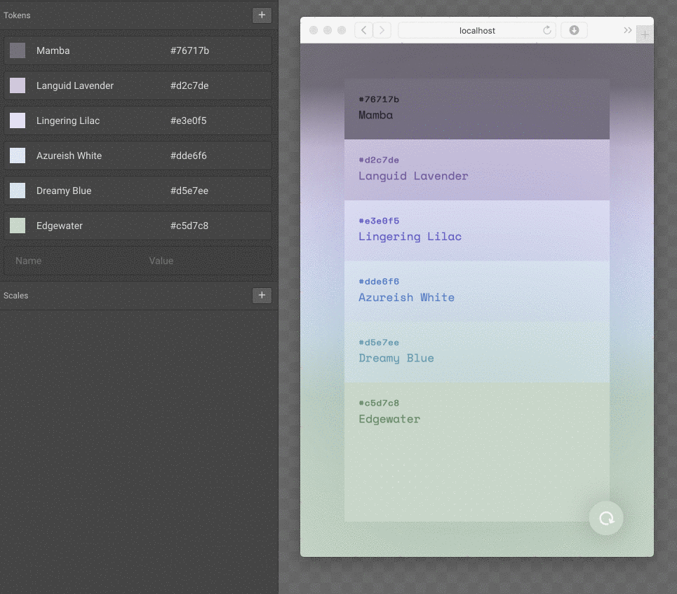
Color Canvas
For example, the color canvas visualizes connections between colors and can be used to transform from one color into another. As known from CSS pre-processors, colors can be darkened, lightened, shifted in hue, desaturated and more. Those are powerful mechanisms not only for developers that want to write less code, but also for designers that want to explore color combinations and design with theming in mind.

The color canvas might not be needed for smaller projects, but certainly shines with complex ones.
Complex systems, such as operating systems or business applications, may use several levels of color abstraction. For instance, MacOS recently introduced Dark Mode and encourages developers to use their color variables found inside NSColor. A different example with five levels of abstraction is Nylas Mail that can serve as an inspiration for setting up colors in Ratio.
In any case, the color canvas can be a great way to explain color systems to collaborators who would otherwise need to imagine it by reading source code or by building a style guide. With Ratio, visualizations that are often left to documentation become actual tools.

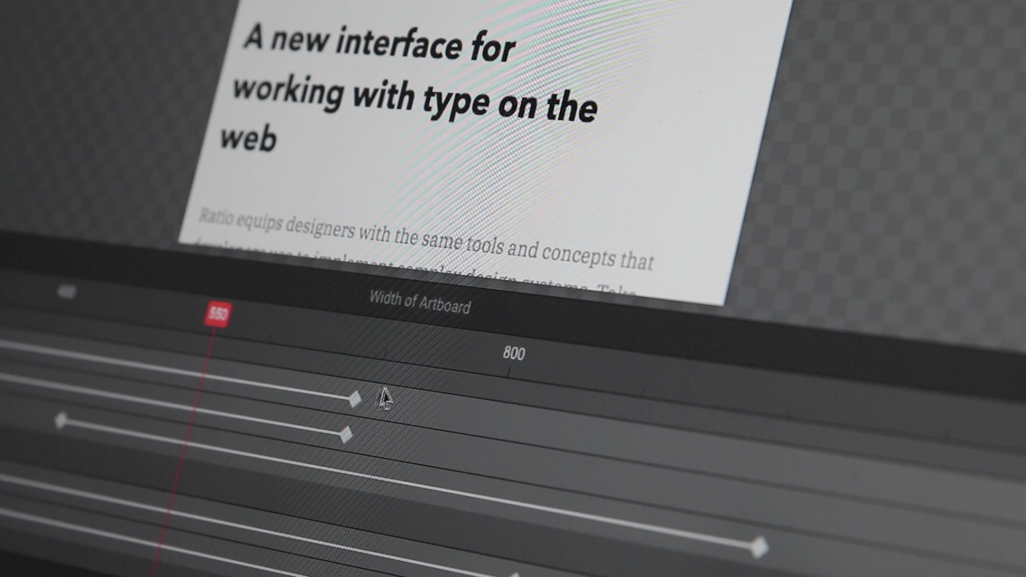
Driver Inspector
Another example of visualization of code is the driver inspector, an interface that works similar to a timeline in video editing tools. In addition to time, it can be used to manipulate values based on other variable inputs such as window size (breakpoints), scroll position (parallax scrolling), mouse position and more.
Each selector is shown with tracks for each property that has changing values. You can use the driver inspector to add, remove and move keyframes or change their corresponding values. It’s a simple way to see what is otherwise hidden in multiple places in your source code.
Credit where credit is due, Principle for Mac has been the main inspiration for using a timeline interface for more than just time.
CSS Inspector
When you select a layer in Ratio, you can see its related CSS declarations in the CSS inspector. That way, you have full access and control over styles — no limits. It’s like writing CSS to a file. But, compared to text editors, Ratio filters out the noise of other selectors so that you don’t need to scroll, jump and search around in your CSS files.
While showing you less, it also shows you more: The inspector highlights use of variables (design tokens), groups breakpoints per property and shows related selectors, such as hover states.
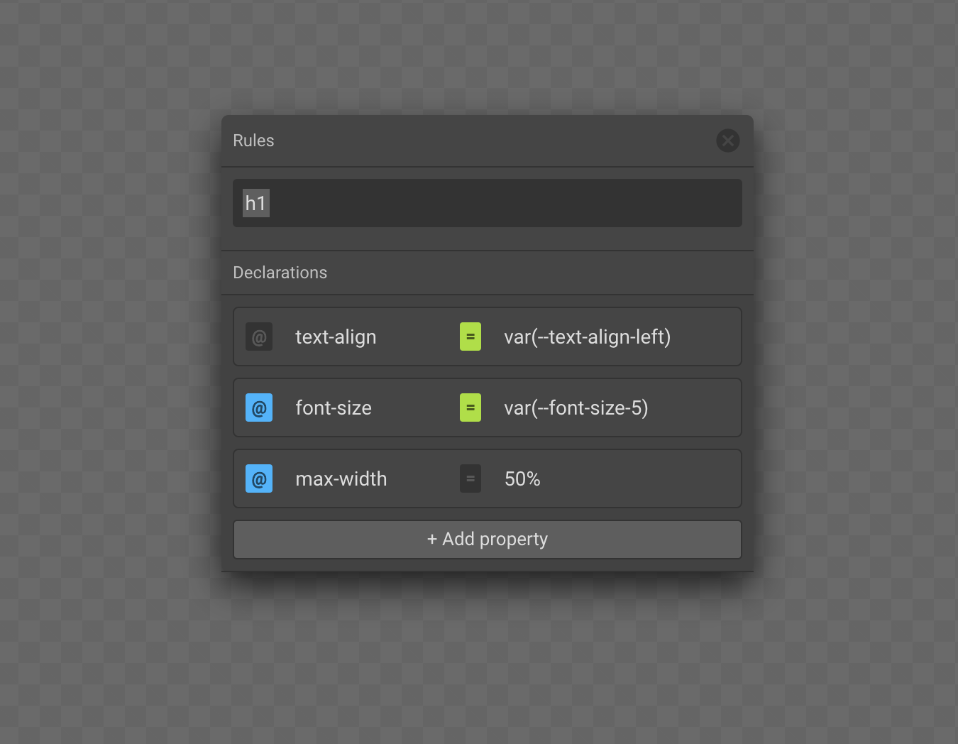
When you want to create a new rule for an existing selector, the inspector searches through all the existing selectors. When you type a selector that has already been defined, Ratio will enter the selector instead of creating it again. The interface prevents you from making unnecessary duplications. It’s like appending new CSS rules to the end of a file but the computer’s automatically cleaning up for you.
Style Dial
The style dial is the gestural counter part to the CSS inspector. It’s a compact interface that combines the most important aspects of typography, color and space into a radial menu. Instead of typing values, it allows you to spin/scroll values up or down while keeping your eyes on the content. The contextual menu has been designed for freestyle design exploration without constraints.
Since it supports keyboard shortcuts to switch between properties, tweaking font size, line height, letter spacing can become a fluid process of scrolling up/down and switching between tools using the keyboard — all while staying focussed on the actual text layer.

Extensibility
While Ratio already offers many different perspectives and interfaces on CSS, there are many more possibilities and web developers have already built tools for specific tasks.
CSS gradient generators, border radius tools, grid builders, color palette generators, modular scales, font pairing tools, … there will always be the need and desire to build custom interfaces and features. Thus, it is important to me that Ratio can be extended and that for instance design tokens can be generated by external tools.
To illustrate this, here’s an integration of the harmonious color palette generator by meodai. David is an expert when it comes to color systems and he’s built dozens of different interfaces to work with color. Using a simple mechanism, his existing web app can hook into Ratio and provide colors for it.
I want Ratio to provide the core tools on its own, but being an active Sketch and Adobe XD plugin developer, I think it’s important to build in extensibility right from the beginning.
A broader understanding of code
For now, we’re used to call code what is plain text in text files that get compiled and can run in a browser. But any form of communication is code. Any word we say, write, any image we draw, encodes information. It’s up to the other to interpret and understand.
When we start to loose our fear of the term code and programming, we can start to see behind the actual principles. The logic. The conditions. The meaning. The rules. It’s what we all work with, but often neglect. But if we embrace them, we can start to design with ratio. We need to become aware of the reasons behind our choices and decisions. And we then need the right tools to capture and express them.
[…] I hope this book inspires you. You can shape the words we use. You can influence design tools and do original work. You can return to tradition and map treasured, old advice onto this new world. — Tim Brown, Flexible Typesetting, p. 205
While I was already deeply working on Ratio, reading this sentence was a great reassurance and motivation to keep moving. Thanks Tim Brown!
The future of Ratio
Ratio is currently in closed Alpha with everything presented here being functional as shown in the video. In a future story I will write about technical aspects of Ratio and how it fits in with your existing projects and workflows.
From designers who want to design in the browser, to designers who want to simply tweak the last design details of a developed site, all the way to developers using it to setup design systems, there are many use cases that I have in mind.