Mac App Design
Chummy
Regular mail applications are like mail boxes that never get empty. Your inbox: never zero. Because everything sits on top of each other, things inside your inbox require sorting in order to find what you need. Since email was introduced no one seems to have questioned how we deal with it; we get used to the idea of email as spam and business. Anyway, we love to send and receive mails with personal content from our family, friends and colleagues.
With Chummy, we introduced our understanding of personal communication: focus on people and conversations. There are no inboxes, no folders and no complicated boolean searches. Instead you can easily find photos, videos and links that someone had sent you the other day. The streamlined, minimal interface helps you to handle all your important mails.

Have you ever looked for a link to an awesome website, that your friend sent last week but you can’t find it anymore? Or have you looked for the photo of a newborn family member? With the introduction of media filters, Chummy helps you to find that content within your emails without thinking about boolean searches.

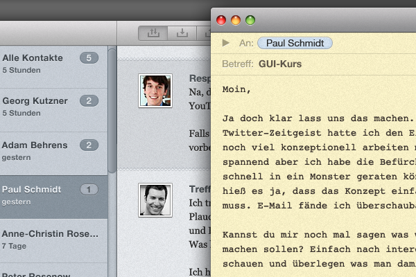
Additionally to Quick-Reply, you can compose a new email in a separate window. Good old Courier and a yellowish background help you to write a clear and structured text that your friends will love.
Chummy is designed for Mac and comes with all the comfort you already know. Simply import your existing accounts and emails from Mail and you are ready for a better mail experience.
But how did we craft Chummy? Since this has been our first attempt on making a graphical user interface for Mac, Julian and I were happy and delighted to be assisted by Timm and Frank, who both have had a lot of experience working with graphical user interfaces. They introduced us to platform standards and attention to details.
Concept wise, we quickly agreed on certain essential features: media filters, persons, conversations. We met at the library and worked separately for only 15 minutes on our personal interpretation of how the concepts would transform into the layout of the application. We’ve never worked at such a pace before but it probably was the best thing I’ve learned: limit the time and be more productive.

After sharing our sketches we were pleased that we had very similar ideas. After the first presentation we continued our work separately. Julian made an impressive first draft with standard GUI elements with HTML and CSS3. Meanwhile with Photoshop, I worked my way towards a more customized look and feel.
The feedback was positive. While we proved that our concept would work with standards, we continued working towards a more unique style that would become present in the Mac OS X Lion after we finished the project. Of course we were aware of apps like Reeder, Tweetie and the alike but we continued regardless with our own vision of the application. We both crafted the application to look like we wanted it to be, I designed the icon and we finished a fulfilling project.